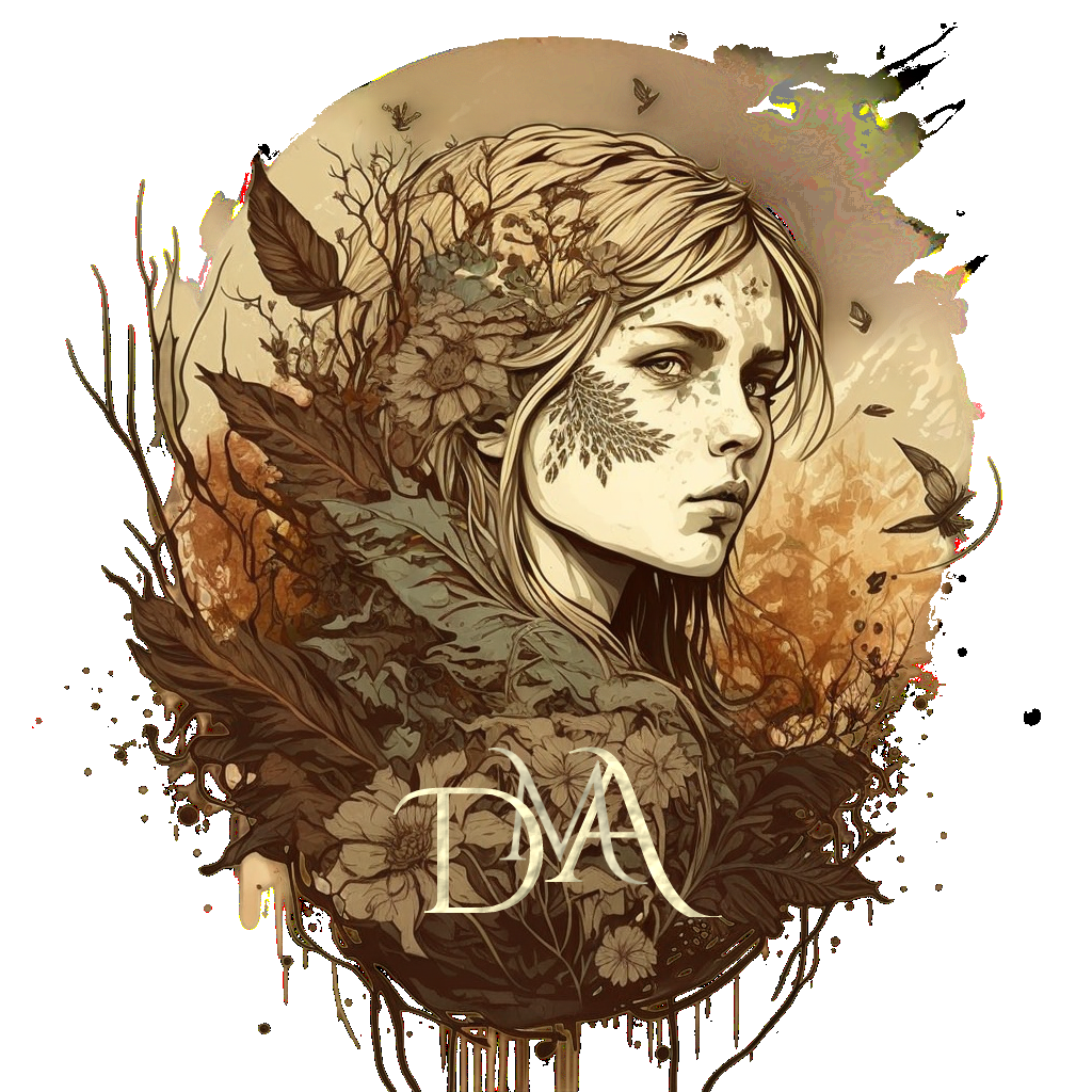


Not everyone will agree with my views, and that’s perfectly fine—perhaps it’s a matter of personal taste. But one of the great marvels of the novel is its ability to ignite the reader’s imagination in ways that film, television, or theatre simply can’t. The story lives in the reader’s mind: the setting, the characters, the emotions, even the costumes. The author provides the framework, but it’s the reader who fills in the gaps. And it’s often in those gaps that the real magic happens.
It’s why we so often hear that the book was better than the film.
That’s also why I believe it’s a mistake for authors to publish overly detailed artwork that risks closing those imaginative spaces. Artwork that offers glimpses or hints—teasing the edges of the world—is fine. But when it becomes too specific, too literal, it can crowd out the reader’s creative engagement.
For me, photorealistic, full-frontal images of characters’ faces on book covers are a definite no. It’s one of my pet peeves. Can a character appear on the cover or inside the book? Yes, but only if handled with care. There are two approaches I think can work: one is to keep the character vague—perhaps turned away, partially in shadow, or obscured by a hood. The other is to avoid photorealism altogether and opt for traditional illustration. This style may show faces, but it leaves room for interpretation. The gaps remain intact.
What do you think—do you agree?
IMAGE: AI generated from Kling AI
Comments ()